Kamis, 29 Desember 2011
Selasa, 27 Desember 2011
Photoshop - What is Threshold?
 There are several ways to adjust the dark and light areas of a photograph. I usually use the Levels tool but you might want to take a look at a tool called Threshold. Let's take a look at how I fixed my old family photo taken in Austria.
Start by creating a new adjustment layer using Threshold. The Threshold tool allows me to see what areas should be white and black in this faded old photograph.
Slide the triangle from right to left to see what should be white. In this example it was the paper in the hands of the family.
Then I slide the the white triangle from left to right to see where the blacks came in. The first data seen was below the skirt.
Knowing this I created a new adjustment layer - Levels. I selected the white eye dropper for the paper and the black eye dropper tool for the shadow under the skirt. And TA DA! I have a restored photograph!

Here is a movie on how I did this.
Kamis, 22 Desember 2011
FREE Gift Tags
A gift for you that's just in time.
Free gift tags!
Select your favorite then just print them out.
http://www.freeprintablegifttags.net/
HAPPY HOLIDAYS TO ALL MY PHOTOSHOP FRIENDS!
Free gift tags!
Select your favorite then just print them out.
http://www.freeprintablegifttags.net/
HAPPY HOLIDAYS TO ALL MY PHOTOSHOP FRIENDS!
Rabu, 21 Desember 2011
Photoshop Beginners Samurai Fantasy

Step 1: First download the files using the resources button and open up a new document 1500 pixels by 1000 pixels.


Step 2: Open up your background Image from the files you downloaded and paste or drag it into your document. Bring up the Free Transform Tool 'Ctrl + T' on the keyboard and position the Image as seen below.

Step 3: Go your layers palette and select the brush identified below and using the color #703500 and using the brush settings you see also below paint as shown.

Step 4: Now open the Tree Image from the files you downloaded and go to Edit/Define Brush Preset. You will now find your new Tree Brush at the bottom of your Brushes. The screenshot says 'Images.jpg' you may call your Tree Brush whatever you like.

Step 5: You can now use you Tree Brush to paint in along the to of you tree line as seen below. Change the size jitter on your brush to 46%.

Step 6: We make another layer for our second tree line and the small hillock use an ordinary hard brush for the hillock and follow the same process as before on the new tree line using this color #4f2807

Step 7: One more layer of trees using this color #4f2807 you can then alter the color slightly making it a little bit darker here and there something like this.

Step 8: We can now start to name our layers, you may do this from the very beginning if you wish. Click on the name in the Layers Palette and enter you chosen name we will do this now with each layer as we progress. We are going to add some grass on a New Layer over the top of the trees use these colors #9d4b1b and #a27416 with the brush settings shown.

Step 9: Make another Layer and cover the hillock with grass using the same techniques as in the last step only make the brush a little bigger.

Step 10: Next we go to Filters/Render/Lighting Effects and use the following settings on the Grass 2 Layer.

Step 11: Now we will add another grass Layer with the brush size set to 119 px and using #642a08 and #815212 as our Foreground and Background colors.

Step 12: Add now a couple more Layers of grass going darker the final one uses Black and a very dark Brown as the Foreground and Background colors.

Step 13: Drop back to the Layer we have called Grass 2 create a Layer above this Layer, hover over the line between the two Layers in the Layers Palette pressing the Alt key and create a Clipping Mask. Using #febb10 as your color and a medium soft brush paint as shown below. Drop the Opacity to 50% on this Layer and then go to Filter/Blur/Gaussian Blur and Blur by 27.8 px.

Step 14: Go to your downloaded resource files and open up the rock outcrop. Using the Quick Selection Tool make a Selection as shown.

Step 15: With this new selection go to Edit/Copy then jump to your original document and with the Layer Grass 1 selected go to Edit/Paste to import your rock outcrop. Then press 'ctrl ' + 'T' to bring up the Free Transform Tool and reposition the rocks like this.

Step 16: Make a copy of the rock Layer by pressing 'Ctrl' + 'J' with this Layer selected 'click on the icon in the Layers Palette holding 'Ctrl' Select your Gradient Tool and drag the Gradient below across the selection, then drop the opacity to 80%.

Step 17: Create another Clipping Mask over the rock color Layer and using #feb10a as your color paint in some highlights, drop the opacity to 69% and go to Filters/Blur/Gaussian Blur and select 9.0 px

Step 18: Back to your source files now open the Figure copy and paste it into your Document re size slightly using your Free Transform Tool this Image has already been cropped for you. Then we are going to use a Filter you need to go to Filter/Filter Gallery/Brush Strokes and follow the settings shown below. You need to place the figure between Grass 4 and 5 Layers.

Step 18: Now go to Image/Adjustments/Match Color and follow the settings.

Step 18: Duplicate the Figure Layer by pressing 'Ctrl' + 'J' and then add the following Layer Style.

Step 19: Now carefully using a your Eraser Tool with an Opacity of around 15% start to carefully Erase from this Layer until it looks the way you want it to. You may add some highlights and fill the gap below the rocks with some foliage or grass I have included some Brushes for this.

Senin, 19 Desember 2011
Article/ Posted 21/09/2012
 This is a beaufully written article by Tom Giannattasio that I found over at Smashing Magazine. G Go to Artcle
G
G
Photoshop - create snow effects on photograph

- First make sure you have Photoshops default colors of Black as the foreground color and white as the background color.
- Create a new layer - Edit > Fill > 50% gray
- Filter > Noise > Add Noise (400% Gaussian with Monochronmatic)
- Filter > Blur > Gaussian blur (2.0 pixels)
- Image > Adjustment > Levels (move triangle slides to the right until it looks like snow)
- Change the blend mode of this layer to Screen

- Enjoy the home made snow!
Senin, 12 Desember 2011
Free Holiday Templates for your photos
Just in time for the Holidays!
I'm repeating an old post because it's still one of my favorites.If you want to print out photos to include in your holiday mailings, how about adding a really festive border first?
HP Creative Studio has numerous frames that you can upload and drop a photo into. There's no need to even create an account. Just upload some photos and drag and drop them into the frame of your choice. Then, select print and print it out on some nice photo paper.
 What about creating your own custom greeting cards? Yup, you can do that too!
 HP Creative Studio allowed me to add some custom text both inside and out and allowed me to print my card directly to my printer.
How about custom gift tags? They even have a template that allows you to drop your own photo into. And the best part of course....it's all FREE.
How neat is that!? Click on the link below to enter their site.
HP Creative Studio
Happy Holidays!
Leona :-)
 Click on the link below to enter their site.
HP Creative Studio
Happy Holidays!
Jumat, 09 Desember 2011
Great Christmas Fonts
Want to make your Christmas letter or card look awesome?
Enjoy these FREE Christmas fonts!
http://www.howtogeek.com/howto/37226/desktop-fun-merry-christmas-fonts/
Enjoy these FREE Christmas fonts!
http://www.howtogeek.com/howto/37226/desktop-fun-merry-christmas-fonts/

Senin, 05 Desember 2011
Photoshop Diasters!
This week instead of focusing on what you should do in Photoshop. I'd like to share what you should never do in Photoshop.
These should make you smile and feel better about any Photoshop "oops" you may have had in the past.

These should make you smile and feel better about any Photoshop "oops" you may have had in the past.
Holiday Bonus
Do any online shopping and wish you had that coupon code to plug in??
Check my other Blog where I share various computer tips and tricks.
Senin, 28 November 2011
Photoshop - Great selection shortcuts
Have you ever been working on an image trying to adjust the color or brightness and nothing is happening?!
This problem could be caused by a couple of things.

Note the selection around the paw. Photoshop was trying to add contrast to just this selection.
A quick shortcut to get rid of a selection is CTRL/CMD D. This quickly deselects any area or object that you might have had selected.
Here is another great trick with selections.
The marking ants indicating a selection is made but it is distracting and making it hard to see the edges as you adjust you can use the CTRL/CMD H to hide the "ants" allowing you to see the entire selection change (including the detail in the edges) without the extra animation you get with making selections. Hitting CTRL/CMD H again brings the selection outline back.
Of course, I've forgotten at times that I've hid the selection making the first trick of deselecting everything very useful!
Enjoy!
My video of the month - Boosting your Wifi signal with a beer can
This problem could be caused by a couple of things.

- You might be on the wrong layer
- You might have a small selection somewhere that you didn't notice
Note the selection around the paw. Photoshop was trying to add contrast to just this selection.
A quick shortcut to get rid of a selection is CTRL/CMD D. This quickly deselects any area or object that you might have had selected.
Here is another great trick with selections.
The marking ants indicating a selection is made but it is distracting and making it hard to see the edges as you adjust you can use the CTRL/CMD H to hide the "ants" allowing you to see the entire selection change (including the detail in the edges) without the extra animation you get with making selections. Hitting CTRL/CMD H again brings the selection outline back.
Of course, I've forgotten at times that I've hid the selection making the first trick of deselecting everything very useful!
Enjoy!
My video of the month - Boosting your Wifi signal with a beer can
Senin, 21 November 2011
Photoshop - Adjustment layer trick

The next time you create an adjustment layer to fix something like brightness and contrast, if the adjustment doesn't do enough just double the effect.
Here is how you do that.
Just drag the adjustment layer down to the new layer icon in the bottom of the layers palette. This doubles the effect of the adjustment layer.
If the effect is too much you can adjust the opacity of the duplicated layer to get just the effect you need.
Selasa, 15 November 2011
Photoshop Beginners Water Droplet Tutorial

Video:
Step 1:
Right-click on the Leaf Image at the bottom of this Tutorial and save it to your desktop then open it up in Photoshop.

Step 2:
Double-click on the Background Layer in the Layers Panel and change it to Layer 0

Click on the 'Create a New Layer' icon to open a New Layer above your Leaf.

Step 4:
Select your Brush Tool and with a hard edge Brush paint some spots of various sizes across your New Layer, using Black as your colour.

Step 5:
Click on the 'Add a Layer Style' icon.

Apply the following ↓↓↓


You may carry on painting water droplets onto this layer with your Brush until you are satisfied with the result.
Resources
http://www.wallpapers247.com/wallpaper/Green-Leaf-01/
Photoshop - Creating GOLD!
 What's better than GOLD nowadays? Gold seems to be more popular than ever before.
So today, I'm going to show you how to create your own gold (at least the look of gold) for FREE!
Photoshop comes with a lot of nice Styles that can be added to a layer with text, or objects that give you really nice effects.
If you are new to Styles check my previous blog on how to use them, where to find some free Styles, and how to add them to your Photoshop Styles pallet by clicking here.
Creating the look of gold can be time consuming. You'd have to apply numerous filters to get the look you want. Or, how about a free download of 30 Free various gold Styles that you can choose from? Today I'm including a link to these gold Styles. Just load them into your Styles pallete and get ready to impress your friends with the look of gold.
Free Gold Styles
Enjoy!
Movie of the Month!
I thought a basketball playing dog was just done with Hollywood movie magic until I saw this.
Rabu, 09 November 2011

Selasa, 08 November 2011
Photoshop Beginners Soda Can Tutorial


Video :
Step 1:
First download and install the necessary files from above then open a new document 900 px by 750 px and using your Gradient Tool fill your Background with this Gradient, you can copy the numbers here ff6e02 ffff00 .

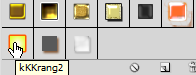
Select your Text Tool and type the first letter 'k' At 170 pt as shown below the second at 210 pt and the third at 240 pt, drop back down to 170 pt for 'RA+N' back up to 240 pt for 'G' and drop to 210 for the exclamation marks. Some of these letters need seperate layers so they can be moved over the top of each other 'kKK ' goes over ''ran' 'G' goes over all of them slip the exclamation marks in behind 'G'. All of these Layers need to be Rasterized by going to Layer/Rasterize/Type. Then go to the Layers Panel and holding down Shift click on each of the text Layers when all the Text Layers are highlighted go to Layer/Merge Layers.


Step 3:
Press Control and 'J' to duplicate this Layer then on the underlying Layer add the first of our Layer Styles.


Step 4:
Import your Image of an Orange between the two Text Images make two copys and using your Free Transform tool posistion two above and one below our Text .
Select your Text Tool again and with the settings below type 'ENERGY DRINK' and add the drop shadow from our Layer Styles .


Step 6:
Import the Skater Boy image over the other Layers the go to Filter/Artistic/Cutout and apply the following settings.

Then go to the Fx button at the bottom of the Layers Panel and add the following Gradient overlay, you can copy the numbers here c83202 d39d00 .

Press Control and 'J' with the Skater Layer selected to make a duplicate Layer hold down Control And click on the Layer icon to Select it the making sure you have Black as your Foreground colour (press 'D' on your keyboard) go to Edit/Fill then Edit/Transform/Flip Vertical , this will be the Skater's shadow, use the Free Transform Tool to reduce the size and go to the Layers Panel and take the Opacity down to 50%


Select the Background Layer with the Orange to Yellow Gradient and go to Filter/Render/Lens Flare and use the settings and posistion below.

Step 7:
Import the 'Tidy Man' and barcode Images and using the Free Transform Tool align them along the Right-hand side . Then you need to Select the Shape Tool.


The Shape Tool has a Menu to load Shapes, the I mage below shows you how to navigate to the Shape you need .


Use the Free Transform Tool again to turn the Text so that it faces East towards your Layer panel.
Your Document should now be looking like this.

Step 8:
Go to Layer/Merge Visible then 3D/New Shape from Layer/Soda Can . Then click on the Cap Material this will open a New Window into which you are going to drag or Paste the last of our Images the Radial-Stainless-Steel.


You may Rotate your Image round using the following controls if you need to,


Step 9:
Open up a new Layer below the Soda Can for whatever Background you create this one is just a simple Gradient.
Add the Gradient with the Gradient Tool to your new Background Layer, Gradient colours are ffffff to 565656

Step 10:
Make a duplicate Layer of the Soda Can (Control and 'J') Fill the underlying Layer with Black .


Then go to Filter/Blur/Gaussian Blur 10 px and drop the Opacity to 30%.
Step 11:
Select your Brush Tool with a hard round Brush, go to Window/Brush to bring up the dialog box and use these settings.


On a New Layer over the top with Black as your colour paint on your water droplets adding the last layer style.


Langganan:
Komentar (Atom)